SYNCHRONY GPT
Designing clearer interactions and system states for Synchrony’s internal AI experience.
Jan 2026 – Present
UI/UX Designer & Illustrator
Figma, FigJam
Synchrony GPT team
Synchrony GPT is the company’s internal AI chatbot. Across two internships with the GPT team, and continuing now, I have worked on the moments around the conversation: the system states people hit when something is loading, missing, restricted, or finished.
System-state screens in the chatbot experience feel less engaging when they lack visual elements, which can reduce user interaction and overall engagement.
How might we enhance the chatbot experience with appropriate visual elements and illustrations so it feels more interactive and increases user engagement?
Because this work was done inside Synchrony, the research, design explorations, and final screens are password protected. Please reach out and I am happy to share access.
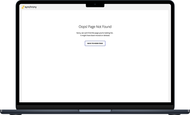
I audited the existing states first. The error screens leaned almost entirely on text: an oversized empty canvas, a headline, and a button, with no visual cue about what had happened or what to do next.
Users scan system-state screens quickly. People usually do not read long blocks of text during loading, error, or waiting states.
Visuals make status messages easier to understand. Illustrations and visual cues help users understand what is happening faster.
Engaging system states improve overall experience. Even brief moments like loading or error screens can shape how polished and interactive the product feels.
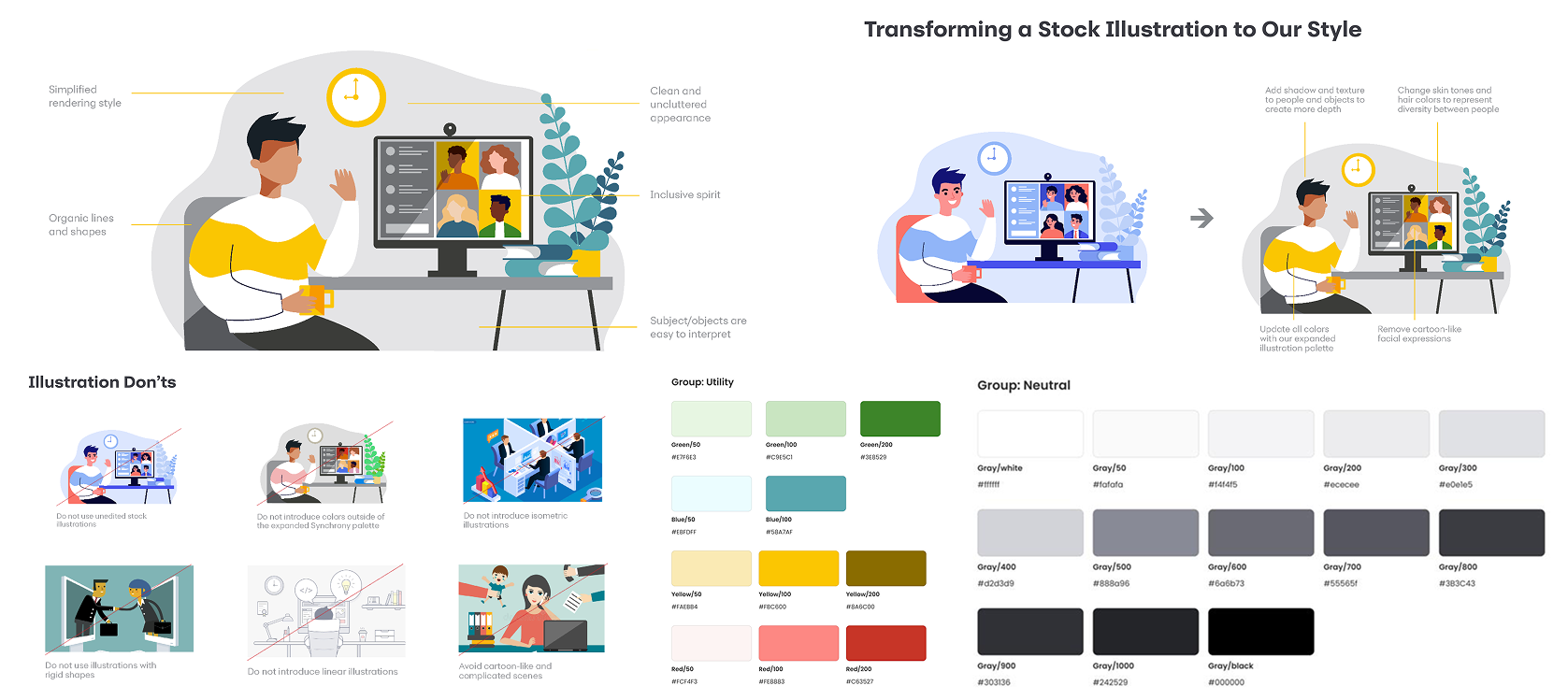
Before drawing anything I studied the illustration guidelines: simplified rendering, organic lines and shapes, a clean and uncluttered look, subjects that are easy to read at a glance, and an inclusive cast. Just as useful were the don’ts — no unedited stock, no colors outside the approved palette, no linear or cartoon-like illustration, no rigid shapes.
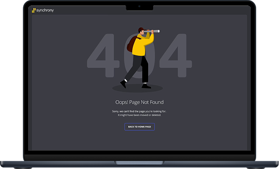
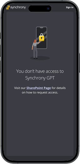
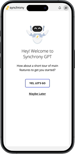
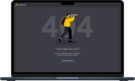
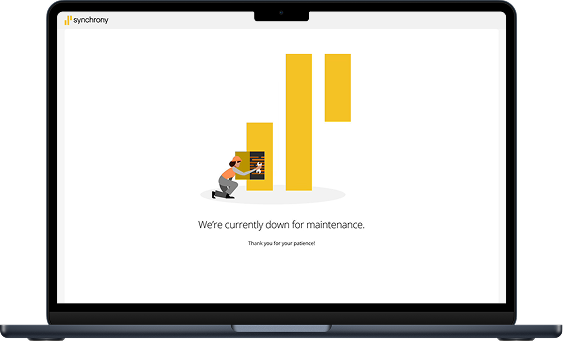
From there I built the set: the GPT robot, the locked-phone access state, the 404 traveler, the maintenance scene, the empty mailbox, and the balloon. Each had to carry its message without making the moment feel technical or like a failure.
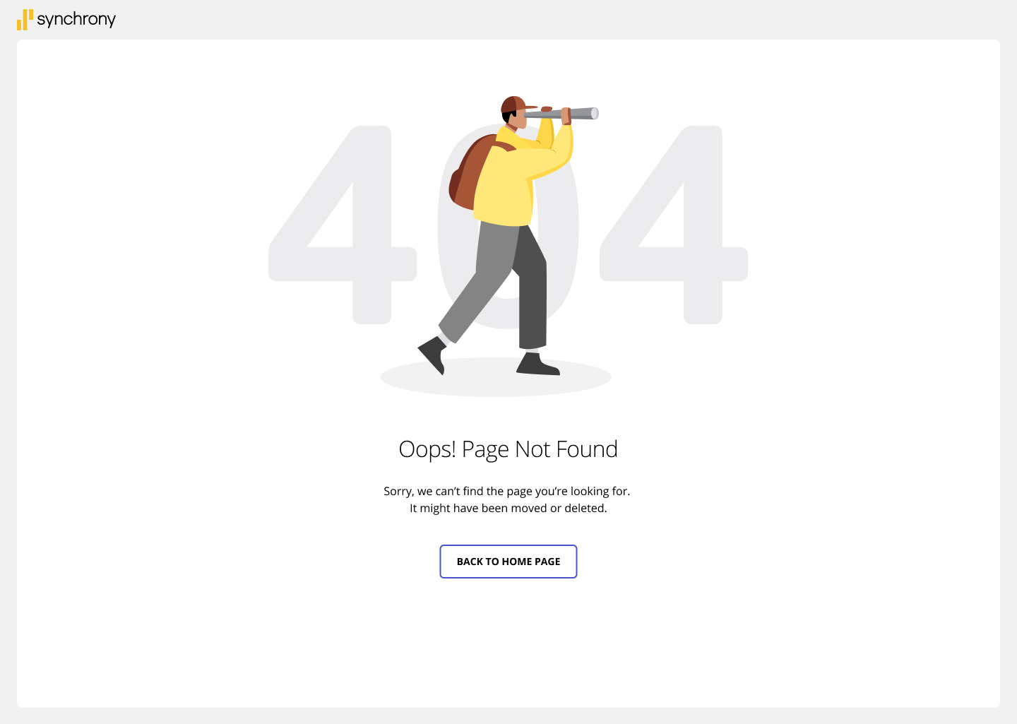
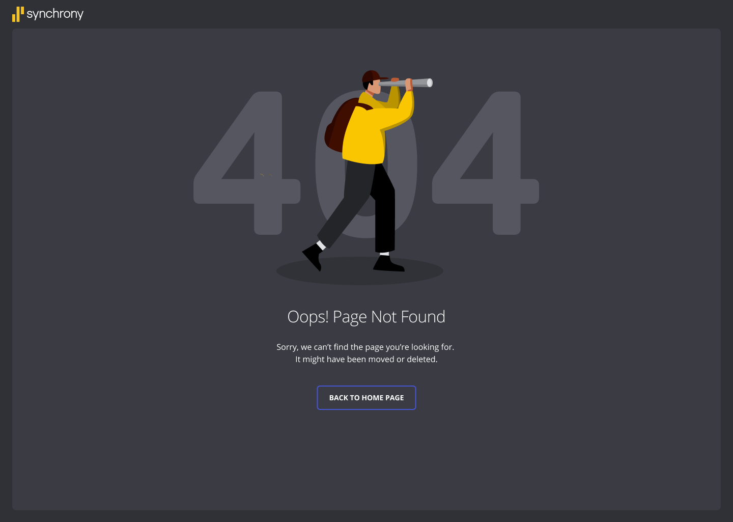
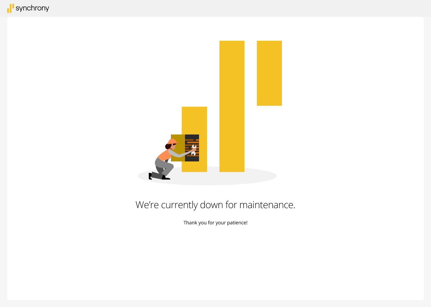
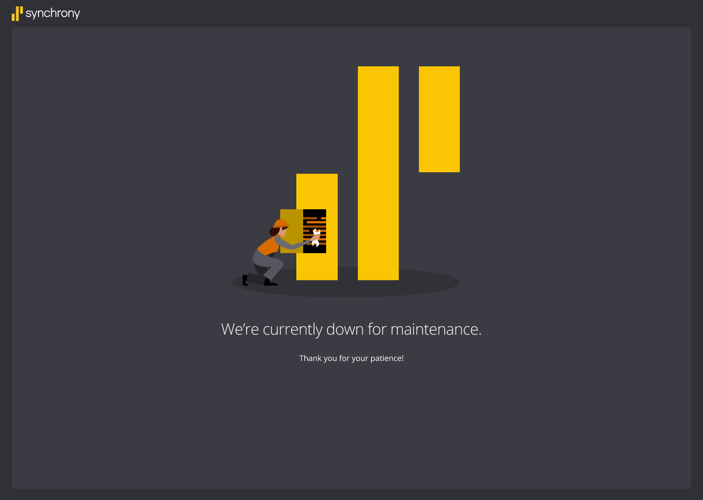
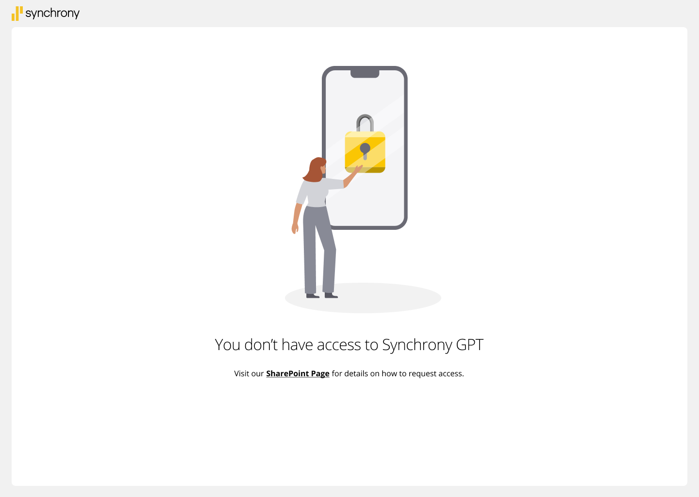
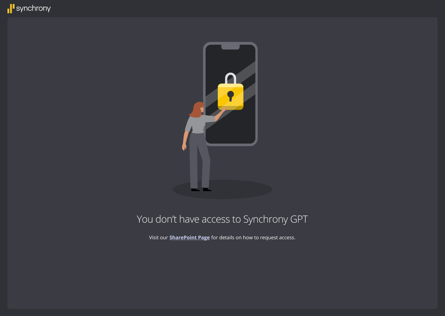
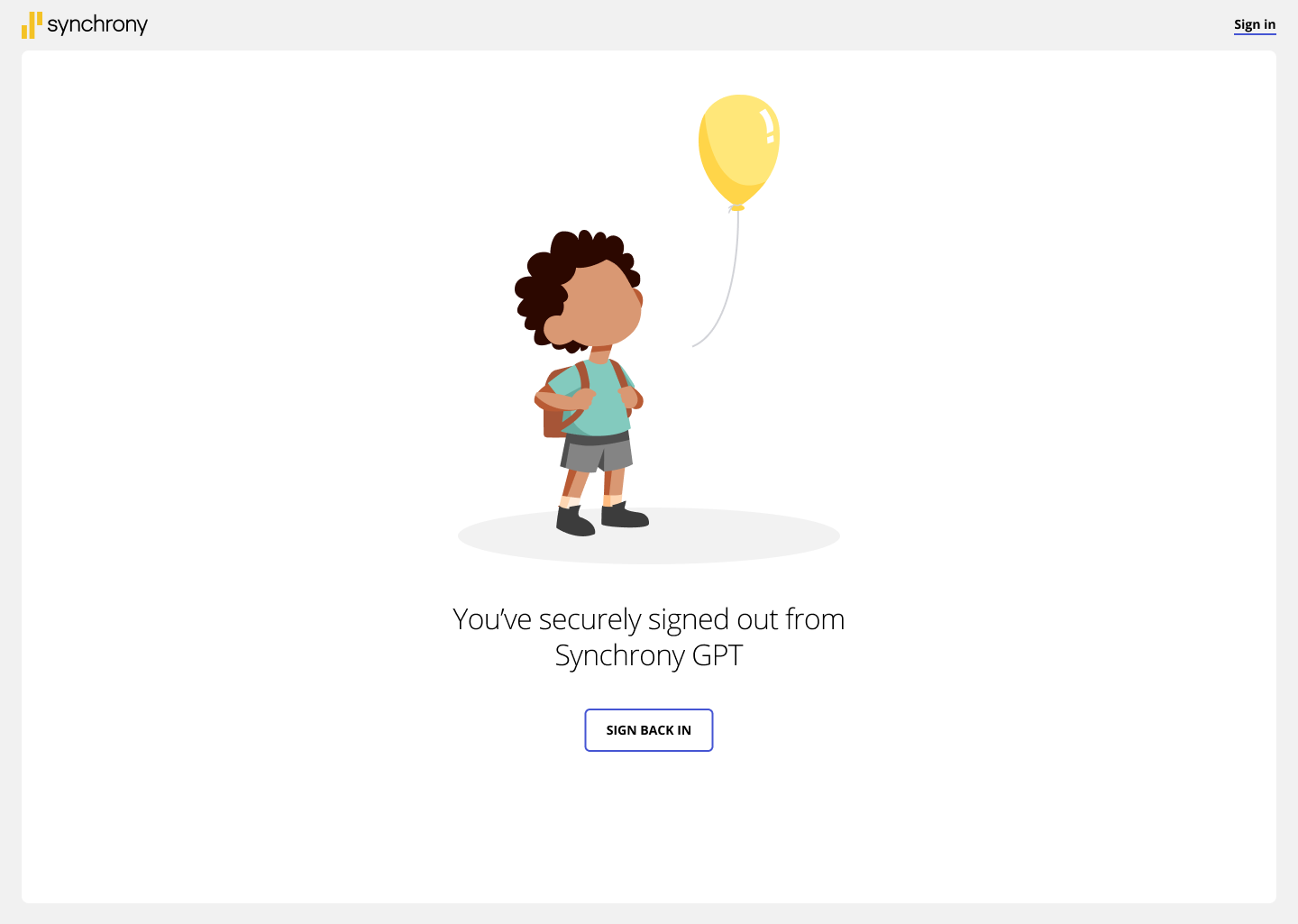
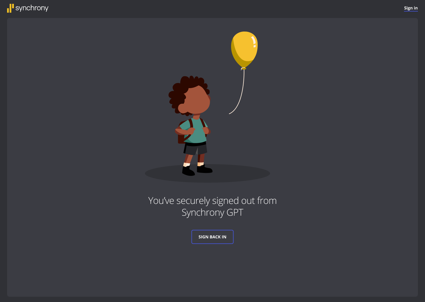
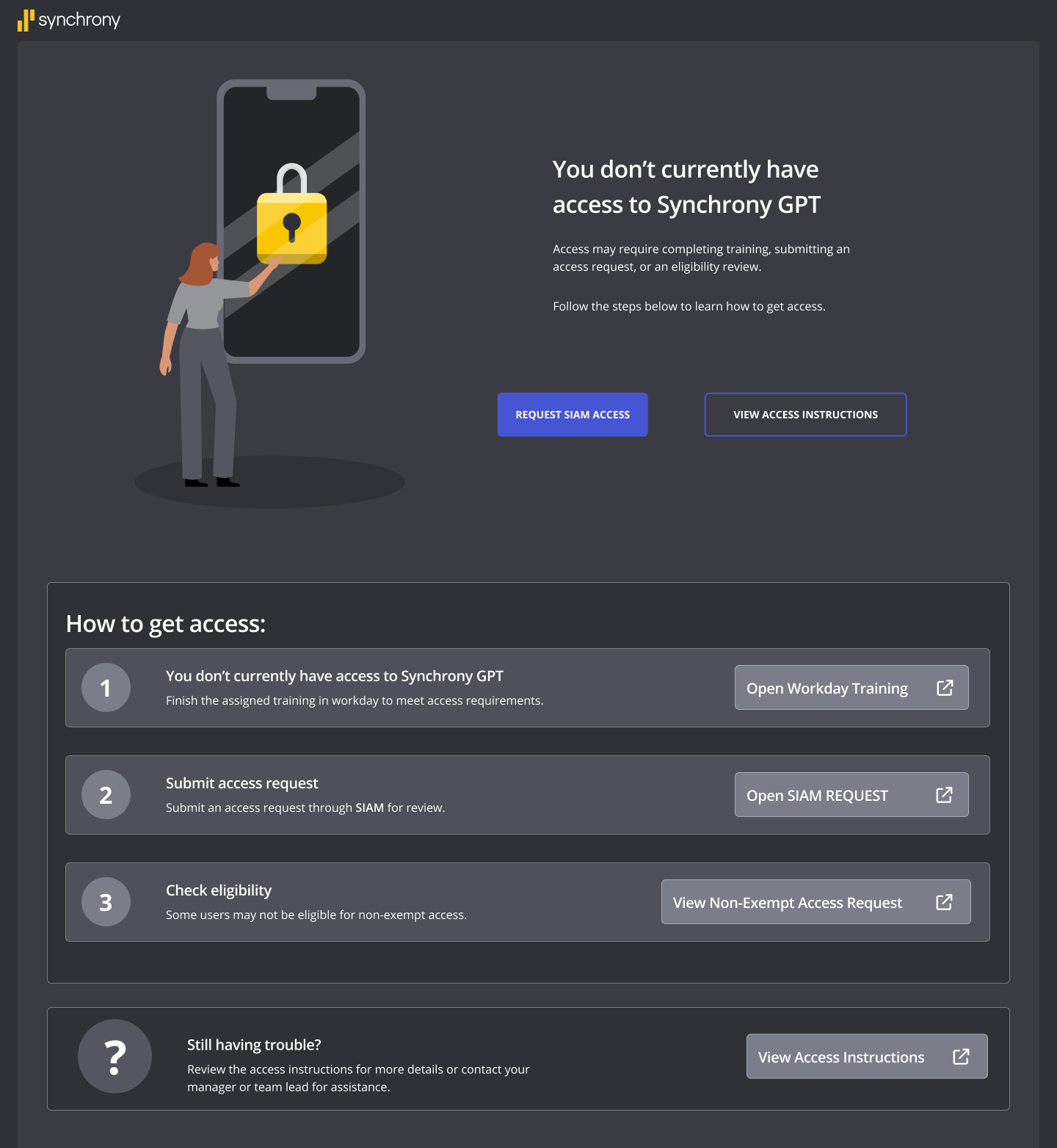
The states shipped across mobile and desktop: onboarding, no access, 404, and maintenance, each carrying the same illustration language in both light and dark surfaces.
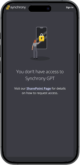
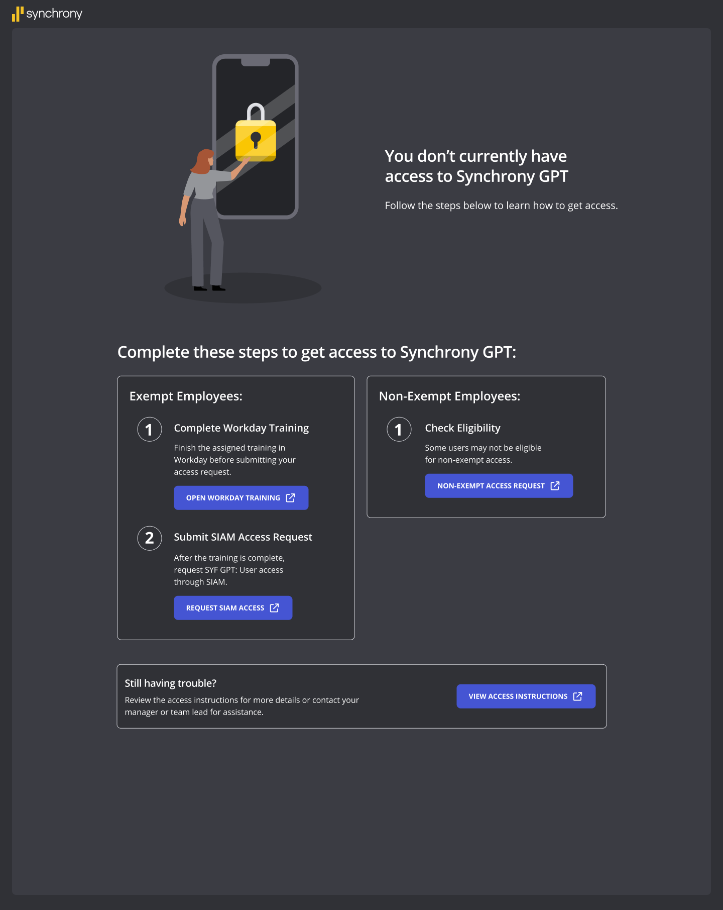
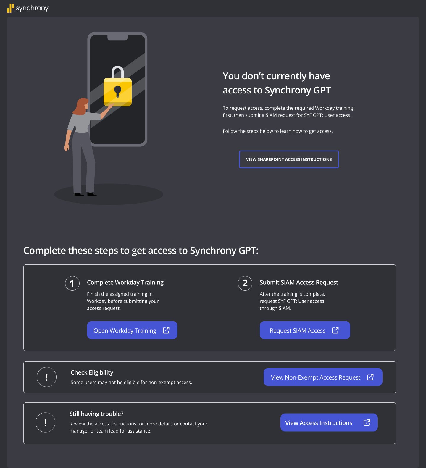
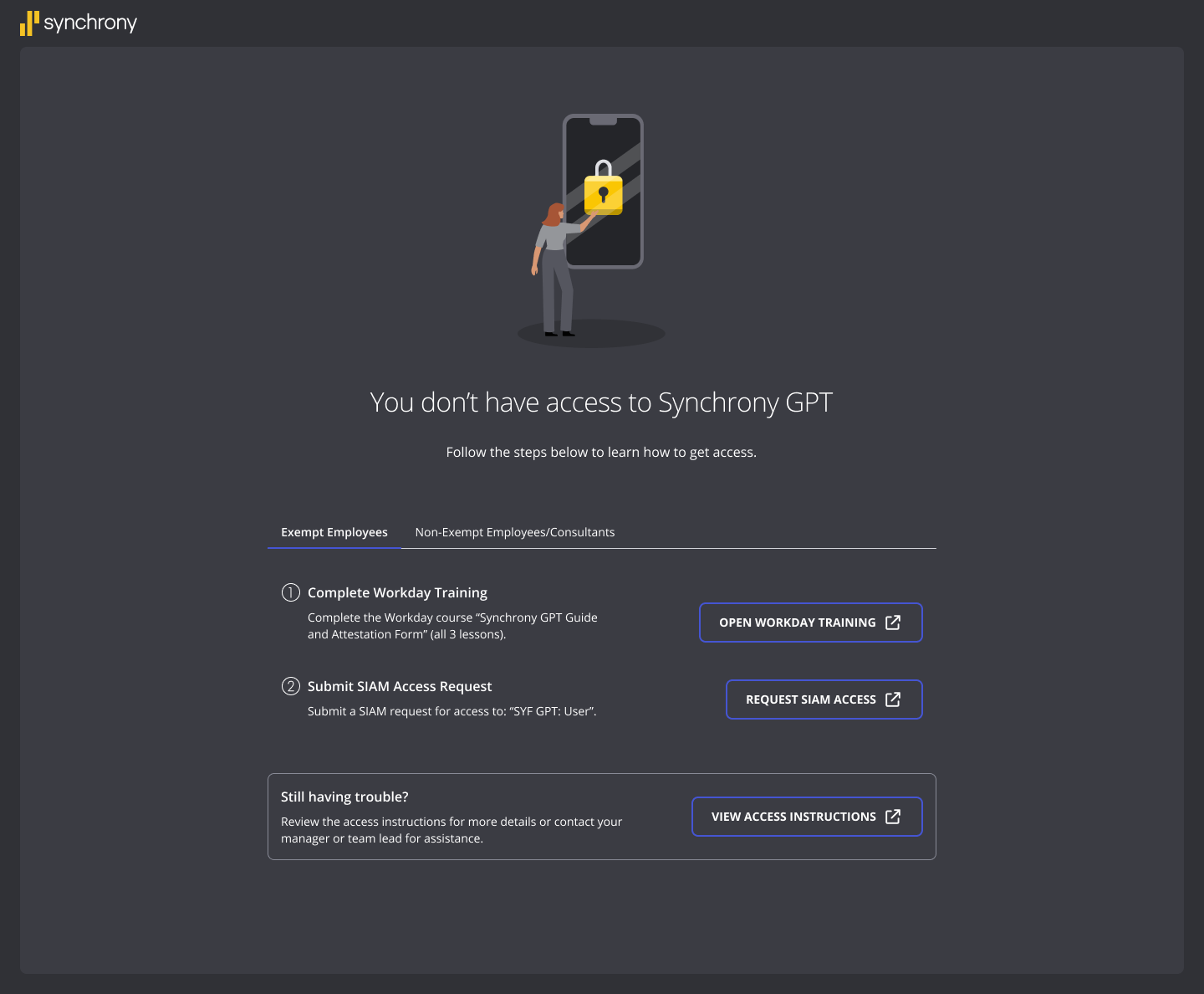
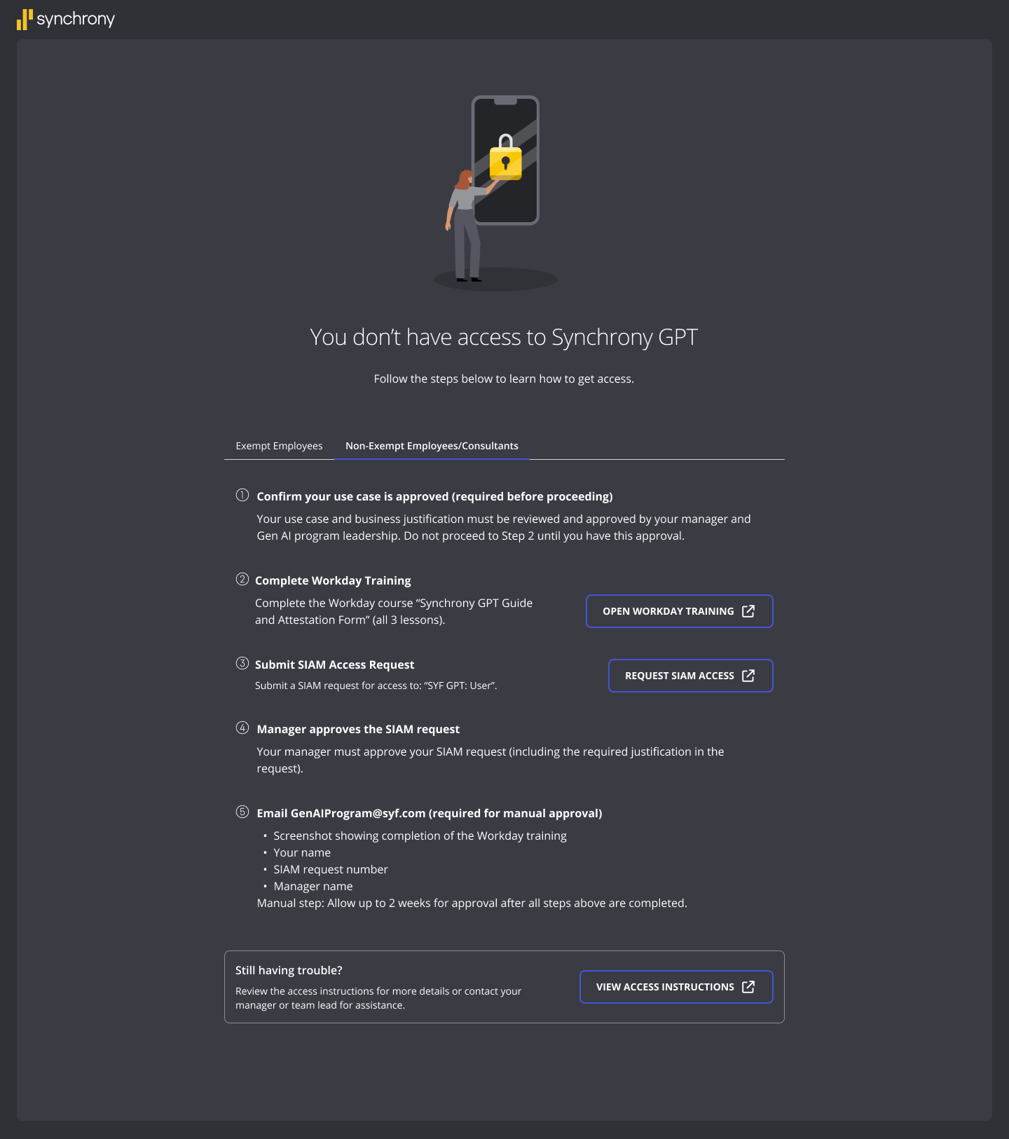
Returning in the summer, I took on the “No Access” experience. Two groups land on this screen — exempt employees who can request access directly, and non-exempt employees and consultants who have to get approval first — and the page had to separate them without burying either path.
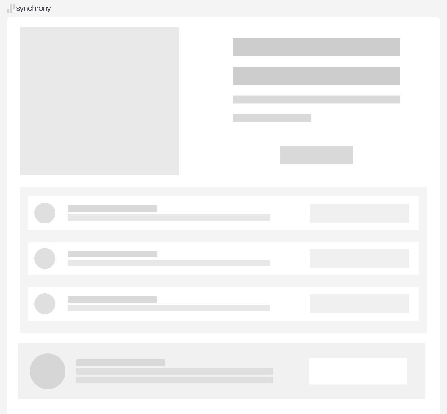
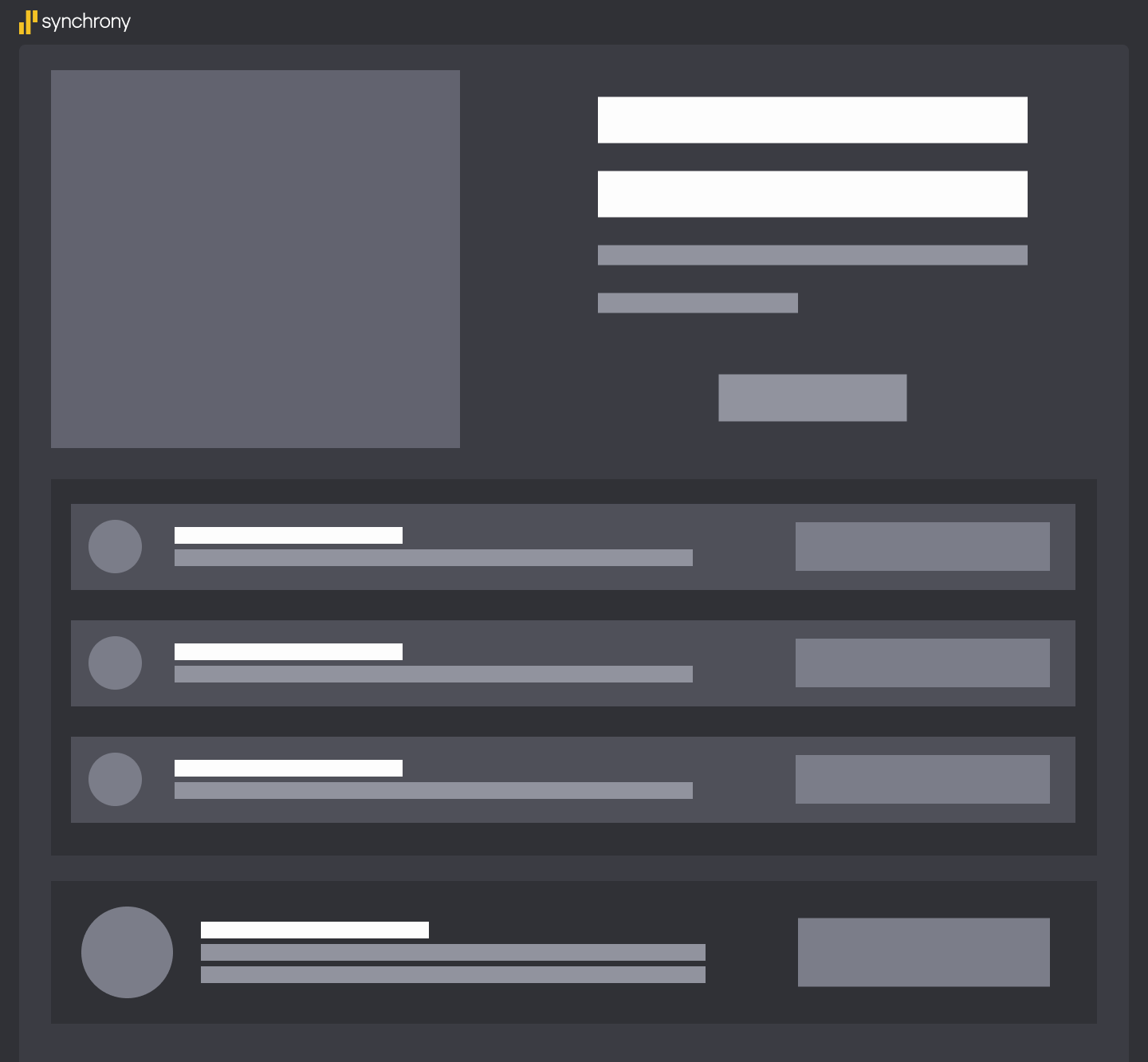
I blocked out the structure first — illustration, headline, the two step groups, and the fallback card — before committing to any visual detail.

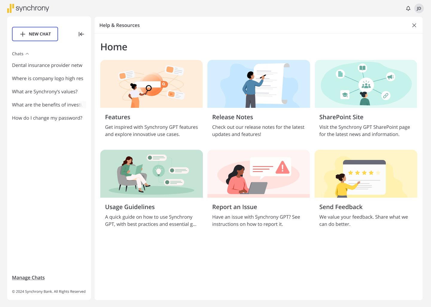
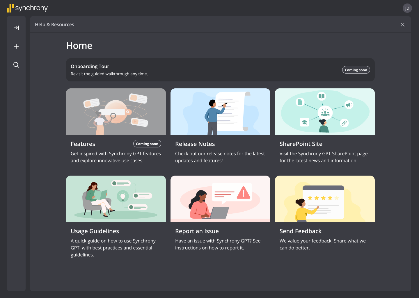
A cohesive set of custom pastel illustrations for Help & Resources, plus a refined page layout and hierarchy so the six cards — Features, Release Notes, SharePoint Site, Usage Guidelines, Report an Issue, Send Feedback — scan in one pass.
Every illustration was built against Synchrony’s design system so desktop and mobile stayed consistent, and I worked with designers and stakeholders to deliver production-ready UI assets.
The biggest shift was learning to design with a purpose. Every illustration I made had a job beyond looking good — it had to tell someone what was happening on a screen they were only going to glance at. I loved that constraint. Working inside an established design system meant I could not invent my way out of a problem, so the clarity had to come from hierarchy, wording, and placement, and getting that right felt better than any pretty screen I have made.
I also got a lot braver about asking questions. Walking into a company this size, I was nervous to speak up at first. What I found was the opposite of what I expected: people were happy to explain things, and asking early saved me from solving the wrong problem more than once. Presenting to designers and stakeholders went from something I dreaded to something I genuinely looked forward to.
Honestly though, the best part was the people. Working with the SYF GPT team and doing two hackathons together taught me how much better an idea gets once you stop protecting it and put it in front of someone. I loved being in the office: the desk conversations, the connection days, the interns I met on the ETC team who I am still close with. That is the reason I am still here today, and the reason this internship ended up meaning far more to me than the work on the screens.